ArcSense Communications Branding & Collateral
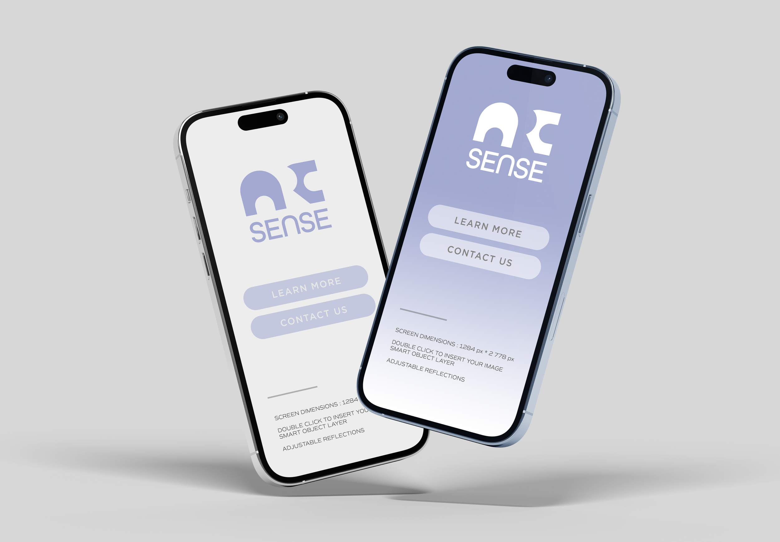
Before its official launch as a full-service marketing and communications agency, ArcSense Communications needed a visual identity that aligned with their company traits: modern, nimble, and approachable. The branding had to resonate with a diverse client base - from biotech firms to independent musicians - and be able to scale and retain relevance as the company grew.
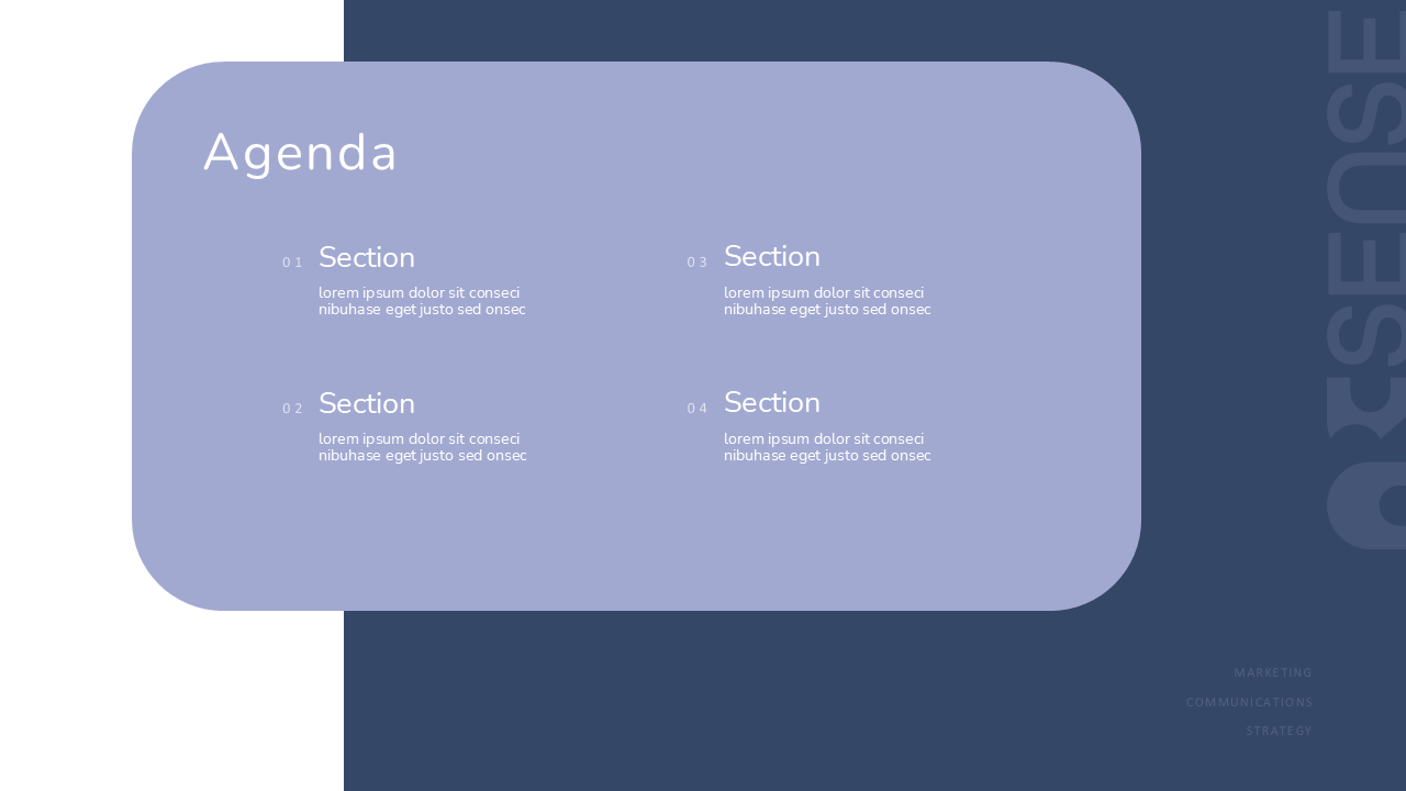
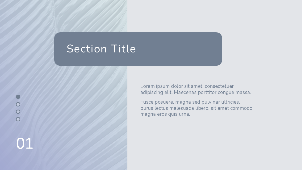
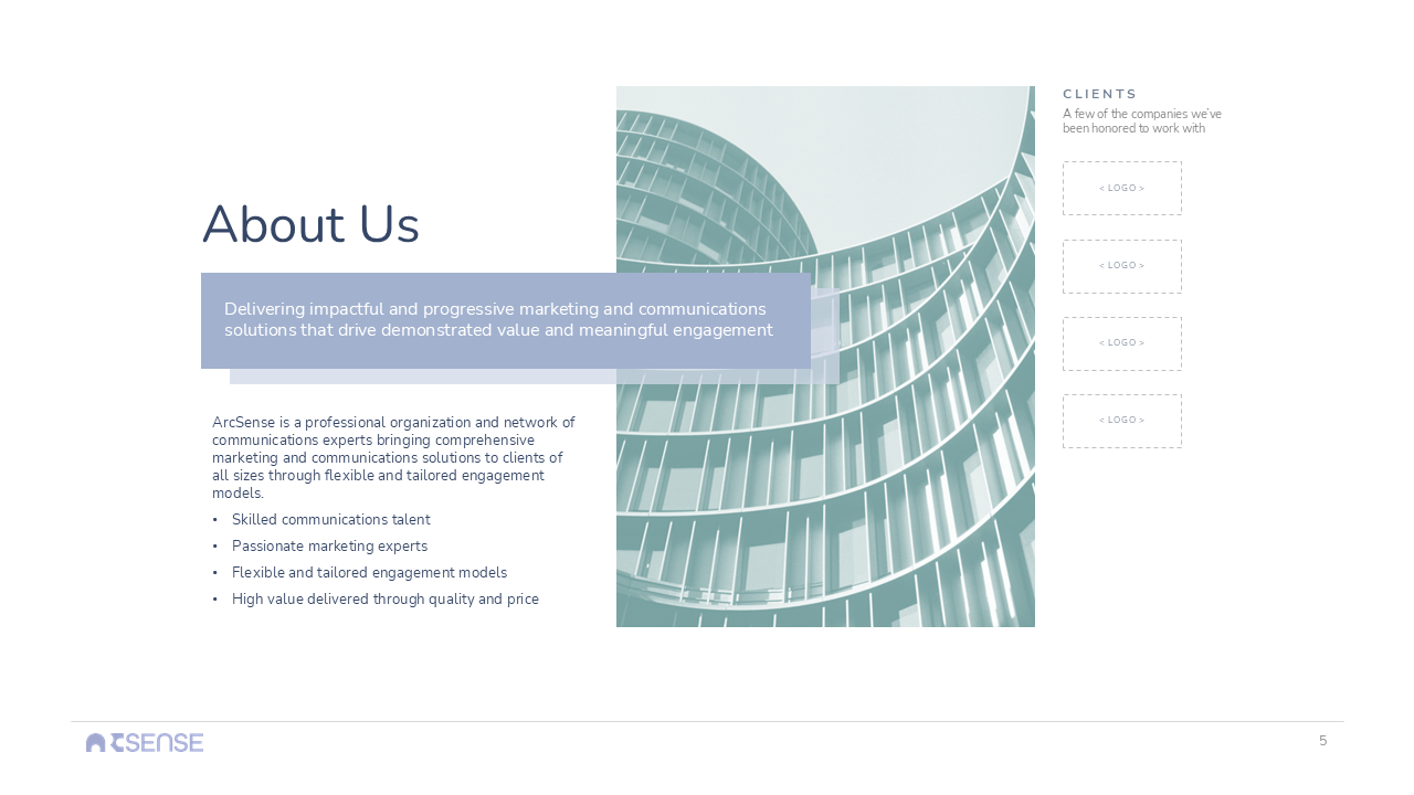
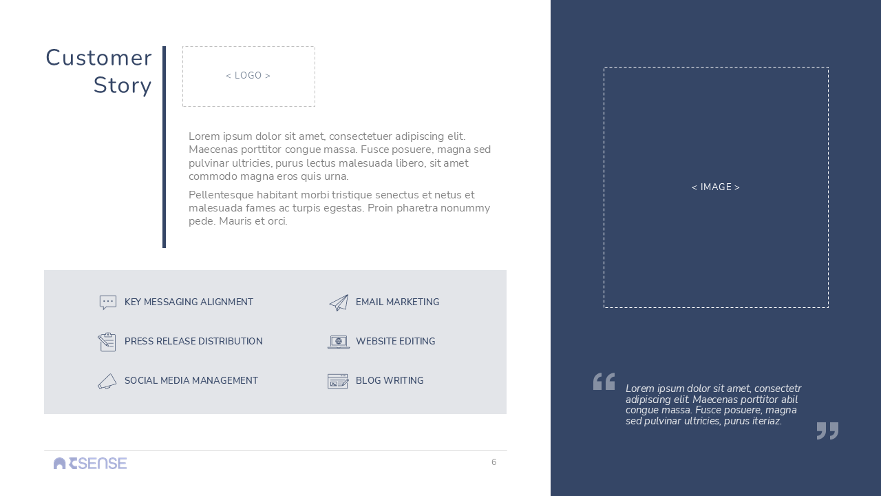
In addition to their brand identity and logo suite, they also requested a customized presentation template for customer pitches and style guide to ensure consistency across all collateral.
CLIENT
ArcSense Communications
SCOPE
Brand Identity
Creative Direction
Logo Set
Brand Collateral
Presentation Template
Style Guide
DURATION
6 Weeks
Process
I kicked off the brand development process by conducting market research and identifying the company’s target audience and key differentiators. This foundation informed a visual identity centered around meaningful engagement.
”Not stale. Not pretentious.” My client's response was music to my ears when we started discussing design direction.
My initial logo sketches leaned on the manipulation of the letter ‘a’, using its curves to evoke images of portals or passageways. The direction shifted after our first review when the client mentioned interest in one of my preliminary sketches not included in the presentation. I quickly developed this into a fourth concept—a strong wordmark leveraging the dynamic lettering and negative space of the company name—which would become the final design.
For color, my competitive analysis revealed that industry peers seemed to know only 2 color speeds: loud, overprocessed primaries or uninspired, bureaucratic dark tones. I opted for a more subdued approach, embracing the sentiment of a famous marketing tagline that sometimes a whisper is most effective in capturing attention.
Color & Typography
A dusky, ethereal lavender was chosen as the primary brand color. The unexpected shade strategically stands out and amplifies the company’s creative and progressive tone. It’s complimented by six secondary colors to form a versatile brand palette that meets design standards for print and web.
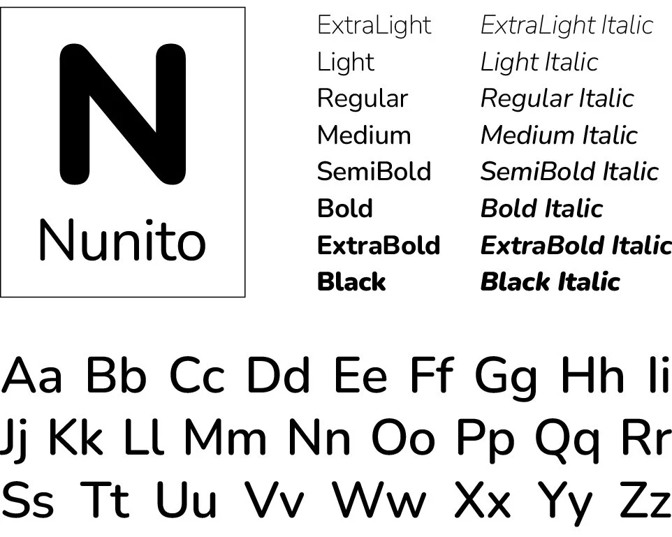
The brand typeface is Nunito, a well-balanced sans serif that doesn’t detract from the logo wordmark and upholds a clean, contemporary feel across collateral.
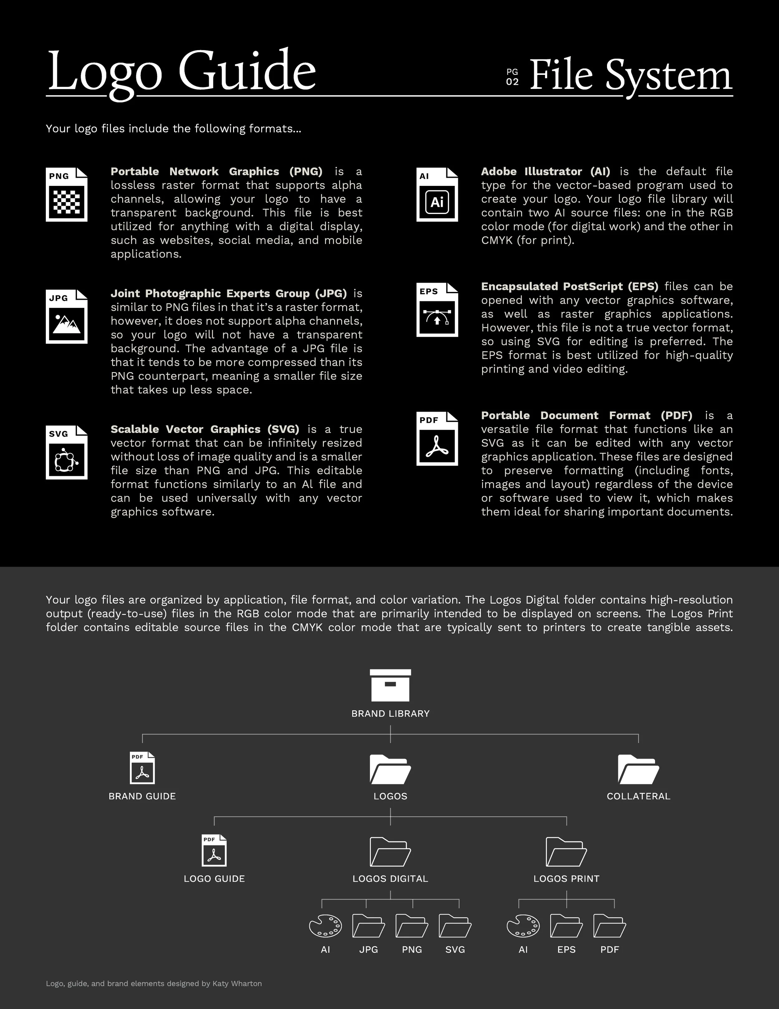
View the logo guide for more details on brand elements and logo usage.
DELIVERABLES
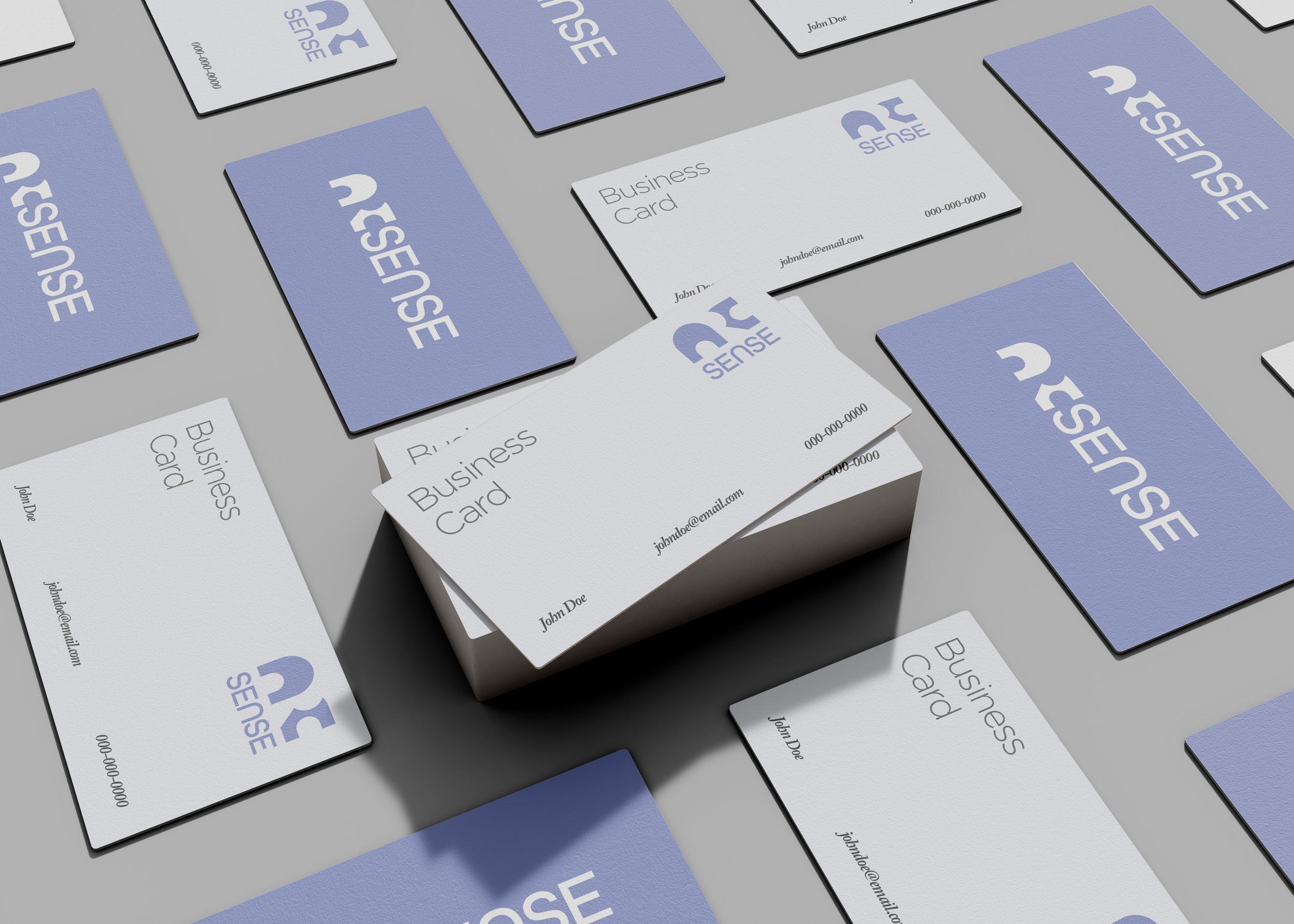
Logo Set - Designed for both print (CMYK) and web (RGB) in Adobe Illustrator, delivered in 2 orientation variations (vertical and horizontal) and 3 color variations (color, white, and black) in multiple file formats (PNG, JPG, SVG, and EPS)
Presentation Template - 16:9 PowerPoint template of 10-15 slides with branded slide master and built-in theme (color palette and typography), comprised of core slides (title, section title, text) + 3 additional layouts with custom graphics, examples, and style guide
Style & User Guides
Outcome
ArcSense gained a recognizable identity and a bold yet refined typographic logo that relies on its own company’s strengths instead of design flourishes or iconography.
In it’s first year, the company grew its client count from two to 13 and increased their team from one to five employees.
ArcSense was – and continues to be – a dream client. They’re consistently collaborative, imaginative, and trusting, and I hope to continue our partnership as their company continues to evolve.

